
More project photos (2)

The problem
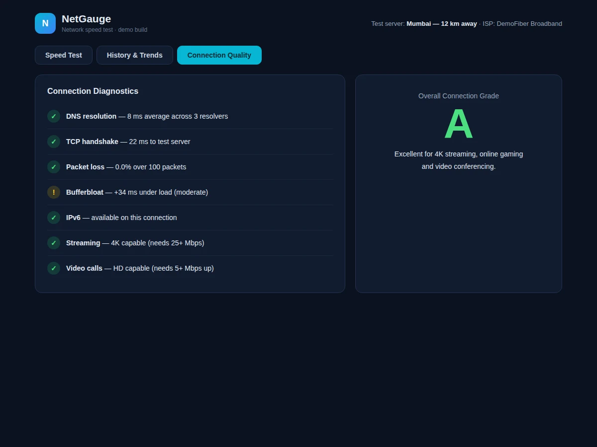
Everyone has run a speed test, but few understand what the numbers mean or how they vary across the day. This project builds NetGauge, a speed-test dashboard that teaches while it measures. The main view centers on an animated SVG gauge sweeping to 142.6 Mbps, surrounded by six metric tiles (download, upload, ping, jitter, packet loss, grade) and a GO button that runs the simulated test sequence live. The History view shows average speeds, tests run and best result as cards, a 14-test download trend chart and a time-of-day bar chart revealing evening congestion, plus a test-history table with per-test grades. The Diagnostics view checks DNS resolution, TCP handshake, packet loss, bufferbloat, IPv6 and streaming/gaming readiness with tick/warning states, ending in an overall connection grade with a plain-language verdict. The demo's test engine simulates the measurement sequence so the complete UX is demonstrable offline.
How it works
- Pressing GO starts the simulated test engine, which ramps the gauge and fills metrics progressively.
- The gauge maps the 0–200+ Mbps scale onto an SVG arc fill with labeled ticks.
- Completed results assign a grade from download/ping/loss thresholds and update the metric tiles.
- The History view renders past tests from a records dataset with per-test grades.
- Canvas charts draw the download trend line and the time-of-day congestion bars.
- The Diagnostics view evaluates seven network-health checks and summarizes them into an overall grade.
Tech stack:
- HTML5, CSS3, vanilla JavaScript (ES6)
- SVG gauge rendering (no library)
- Canvas 2D API for trend charts
- Simulated measurement engine
- Dark network-ops theme
| Parameter | Value |
|---|---|
| Views | 3 (Speed Test, History & Trends, Connection Quality) |
| Gauge range | 0–200+ Mbps with labeled ticks |
| Metrics | Download, upload, ping, jitter, loss, grade |
| History | 6 test records with grades |
| Diagnostics | 7 checks with tick/warning states |
| Dependencies | None (single HTML file) |
| Deployment | Any static host |
Project features
- [Animated speed gauge] SVG arc that sweeps to the measured value with labeled scale ticks.
- [Six metric tiles] Download, upload, ping, jitter, packet loss and connection grade side by side.
- [Simulated test engine] GO button runs a live measurement sequence updating gauge and metrics.
- [Test history] Table of past tests with servers, speeds, pings and A/B/C grades.
- [Trend charts] 14-test download trend line and time-of-day bars on canvas.
- [Connection diagnostics] Seven checks (DNS, TCP, loss, bufferbloat, IPv6, streaming, video calls) with verdicts.
- [Plain-language grading] Overall A/B/C grade with a readable readiness summary.
What is included
- Complete source code (single-file dashboard with all views)
- SVG gauge component with scale mapping
- Simulated test engine with grading logic
- Test-history and diagnostics datasets
- Setup guide (real measurement via test server + Network Information API)
- Project report PDF (networking metrics, gauge design, methodology)
- PPT presentation for final review
- Viva Q&A preparation document (throughput vs ping, jitter, bufferbloat)
Limitations & prerequisites
- Measurements are simulated in the demo; real throughput testing needs a test server endpoint (documented extension).
- Grades use simplified thresholds, not a standards-body methodology.
- History is demo data; long-term monitoring needs scheduled tests and storage.
- Single test-server profile in the demo build.
Frequently Asked Questions
Are the speeds real measurements?
The demo's test engine simulates the measurement sequence so the full UX — gauge sweep, metric fill-in, grading — works offline. The setup guide documents wiring a real test server for live throughput.
What do jitter and bufferbloat mean?
Jitter is the variation in ping over time; bufferbloat is extra latency under load. The diagnostics view explains each check in plain language with pass/warning states.
How is the grade decided?
Download speed, ping and packet loss map to A/B/C bands; the overall grade summarizes all three, shown with a readable verdict like "Excellent for 4K streaming".
Why is evening slower?
The time-of-day chart shows congestion patterns — shared links slow when many users are online, which the demo data illustrates realistically.
What will I learn?
Networking metrics, SVG data visualization, simulation design and dashboard UX.
Is this project suitable for a final-year project?
Yes — for Computer Science and IT programs. It turns networking concepts into a visible, interactive product. Suitable for B.E./B.Tech final-year projects in Computer Science and IT.
Components & software requirements
- HTML5, CSS3, vanilla JavaScript (ES6)
- SVG gauge rendering (no library)
- Canvas 2D API for trend charts
- Simulated measurement engine
- Dark network-ops theme
Delivery information
Built-to-order project. Delivery timeline is shared after order confirmation based on current queue.
Support terms
Complete documentation, setup guide, and viva preparation included. Support for setup and explanation provided.