
More project photos (2)
The problem
Most free weather dashboards either drown the user in raw meteorological fields or show a single temperature number with no context. Students, commuters and event planners need the practical middle ground: what the next few hours look like, how the week trends, and whether the air is breathable — in one glance. This project builds exactly that as a single-page web application with a modern dark-theme interface: a current-conditions hero with feels-like temperature, a 10-hour forecast strip, a canvas-drawn 7-day temperature trend chart, station readings for the last 6 hours, AQI panels with health badges, and a regional snapshot table covering six major Indian cities. The front end is honest about its data: every figure on screen is bound to a structured forecast dataset, so the app behaves like a real product instead of a mockup with random numbers.
How it works
- The dashboard loads a structured forecast dataset (current, hourly, daily, station and AQI objects per city).
- The Today view renders the hero card, hourly strip and AQI panel from the active city's data.
- Canvas helpers draw the 7-day high/low temperature lines and the hourly bars from the same series.
- Switching city via search or chips updates one shared state object, and all three views re-render consistently.
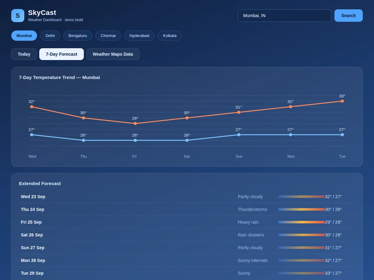
- The 7-Day view shows the trend chart plus extended rows with rain-probability intensity bars.
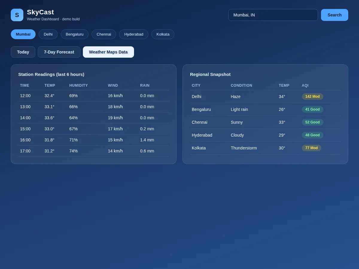
- The Regional view renders station readings and the six-city snapshot table for comparison.
Tech stack:
- HTML5, CSS3, vanilla JavaScript (ES6)
- Canvas 2D API for temperature charts (no chart library)
- Single-page tab navigation with shared state object
- Responsive card-based dark theme
- Static deployment (no server or database)
| Parameter | Value |
|---|---|
| Views | 3 (Today, 7-Day Forecast, Regional Data) |
| Cities included | 6 Indian cities (demo dataset) |
| Hourly coverage | Next 10 hours per city |
| Forecast horizon | 7 days with high/low and rain probability |
| Charts | Canvas-drawn; no external libraries |
| Dependencies | None (single HTML file) |
| Data source | Structured demo dataset; API-ready shape |
| Deployment | Any static host |
Project features
- [Current conditions hero] City, timestamp, condition, big temperature readout with feels-like, sunrise/sunset, humidity, wind, pressure and UV index in one card.
- [Hourly forecast strip] Next 10 hours with temperatures, condition labels and proportional bars, rendered from the hourly series.
- [7-day temperature trend chart] High/low lines drawn on canvas with day labels and value callouts — no chart library needed.
- [Extended forecast rows] Seven daily rows with condition text, high/low ranges and intensity bars scaled by rain probability.
- [Air quality and alerts] AQI value with health badge, PM2.5/PM10/O3 figures and a severe-weather alert banner.
- [City search and quick-switch] Search box plus one-tap chips for Mumbai, Delhi, Bengaluru, Chennai, Hyderabad and Kolkata sharing one state object.
- [Station and regional tables] Six-hour station readings and a regional snapshot table so every view stays consistent.
What is included
- Complete source code (single-file dashboard app with all three views)
- Realistic multi-city forecast dataset in structured JS objects
- Canvas chart helpers (temperature lines, hourly bars)
- Setup guide (hosting, swapping in a live weather API)
- Project report PDF (data model, rendering approach, methodology)
- PPT presentation for final review
- Viva Q&A preparation document (dashboards, canvas charts, state management)
Limitations & prerequisites
- Ships with a demo dataset, not live data — wiring a real forecast API is a documented extension, not included by default.
- City list is fixed at six cities in the demo; adding cities means extending the dataset.
- Charts are drawn for the demo data ranges; extreme values may need axis rescaling.
- No user accounts, saved preferences or push alerts in this build.
- The app is front-end only; there is no backend caching or rate-limit handling.
Frequently Asked Questions
Does it use live weather data?
The delivered build uses a realistic structured demo dataset shaped like a real forecast API response, so every screen works offline. A setup guide documents how to swap in a free API key for live data.
How are the charts drawn?
With the Canvas 2D API and hand-written helpers — no Chart.js or D3. This keeps the bundle dependency-free and gives you real rendering code to explain.
Can I add more cities?
Yes. Each city is one data object (current, hourly array, daily array, station rows, AQI); add the object and a chip, and all three views pick it up automatically.
Is it mobile-friendly?
The layout uses responsive grids that stack on narrow screens; the demo is optimized for desktop dashboards.
What will I learn building this?
Data modelling for dashboards, canvas chart rendering, single-page state management and responsive UI design.
Is this project suitable for a final-year project?
Yes — for Computer Science, IT and Web Development programs. It demonstrates front-end architecture, data visualization and API-ready data design. Suitable for B.E./B.Tech final-year projects in Computer Science, IT and Web Development.
Components & software requirements
- HTML5, CSS3, vanilla JavaScript (ES6)
- Canvas 2D API for temperature charts (no chart library)
- Single-page tab navigation with shared state object
- Responsive card-based dark theme
- Static deployment (no server or database)
Delivery information
Built-to-order project. Delivery timeline is shared after order confirmation based on current queue.
Support terms
Complete documentation, setup guide, and viva preparation included. Support for setup and explanation provided.