
More project photos (2)
The problem
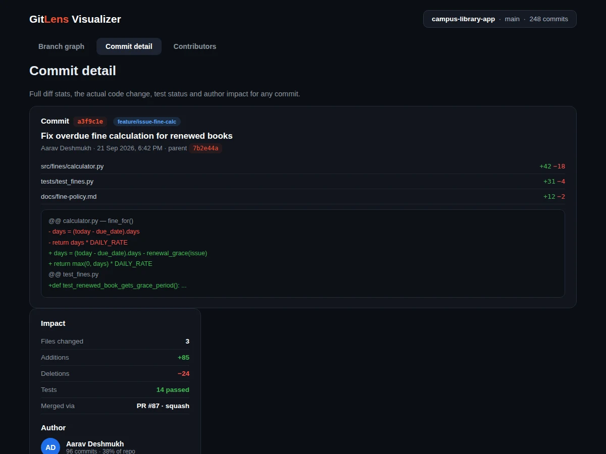
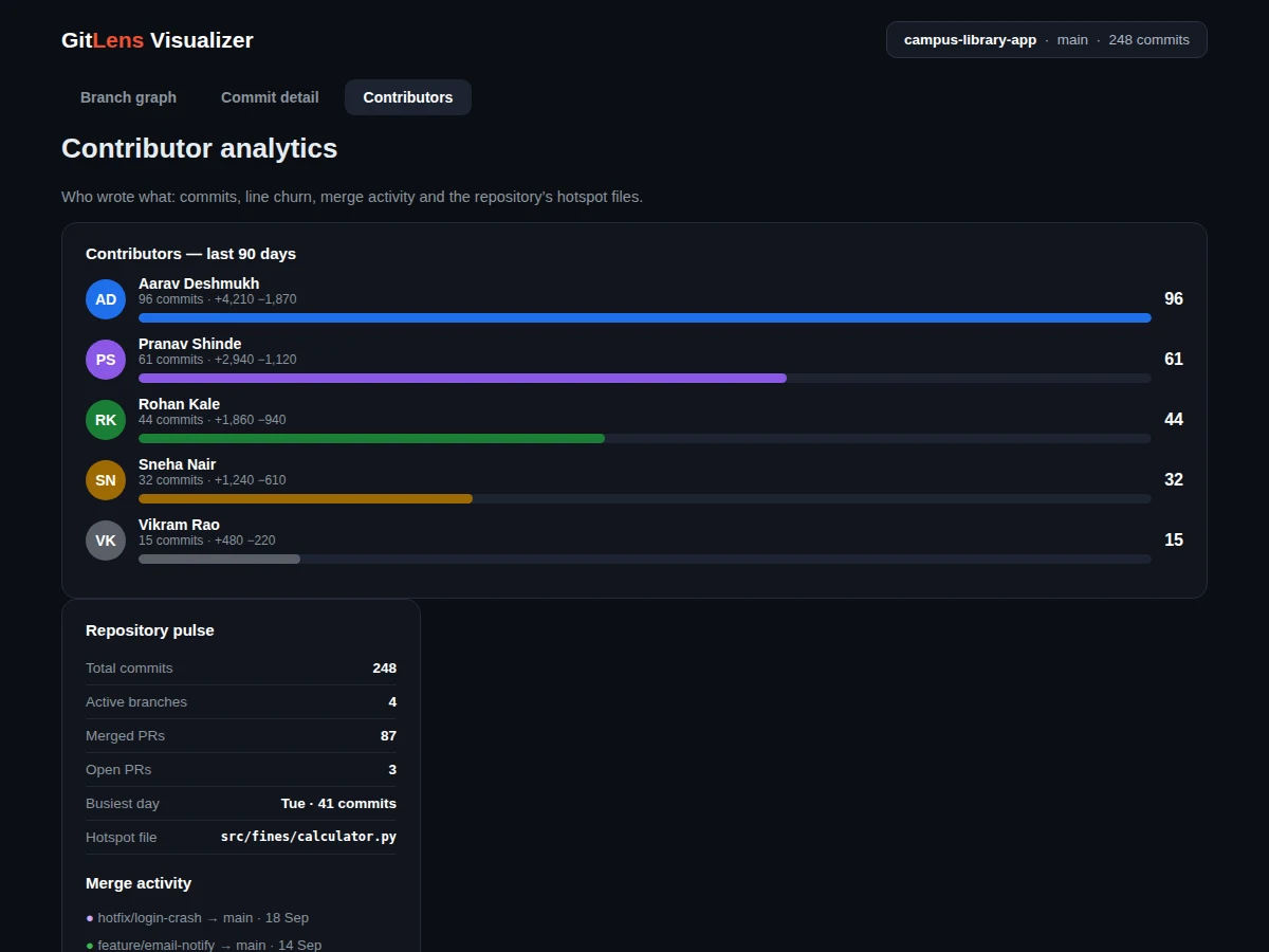
git log is a wall of text: students working on team projects can see that commits exist but cannot see how branches relate, where merges happened, or who actually wrote what. This project builds a visualiser that parses a repository's commit graph and renders it as an interactive diagram — branches as coloured lanes, commits as nodes, merges as curves — with every node clickable to reveal the full commit: message, author, timestamp, parent, files changed with addition/deletion counts, and the key hunks of the diff. A contributor panel aggregates the human side: commits per author, lines added versus removed, merge activity and the files changed most often (hotspots). The demo ships with a realistic dataset modelled on a student team project (four branches, three merged pull requests, five contributors), and the report documents the graph-layout algorithm, the data model and how a real repository's data would be ingested. It is the rare developer-tool project that is both technically meaty and immediately demonstrable.
How it works
- Commit data (SHA, parents, author, timestamp, message, file stats) is loaded from the bundled dataset or a
git logexport. - A layout algorithm assigns each commit to a branch lane and an x-position by topological order, drawing merge curves between lanes.
- The SVG graph renders nodes, lanes, merge curves and labels; clicking a node opens its detail view.
- The detail view shows the commit metadata, per-file change stats and the key diff hunks with added/removed line highlighting.
- An aggregation pass computes per-author commits and line churn, plus repository totals and hotspot files, for the analytics panels.
- The ingestion guide documents the
git log --prettyformat the visualiser accepts for visualising any real repository.
Tech stack:
- HTML5, CSS3, JavaScript (ES6)
- SVG (graph rendering, no chart library)
- Git log parsing (ingestion script, Python)
- JSON dataset format (documented schema)
| Parameter | Value |
|---|---|
| Rendering | Pure SVG, no external chart libraries (implemented) |
| Graph capacity | Tested with 250-commit datasets; smooth pan at 500+ nodes (expected) |
| Dataset format | Documented JSON schema; git-log ingestion script included (implemented) |
| Diff display | Per-file add/del stats + key hunks with syntax-neutral highlighting (implemented) |
| Analytics | Per-author commits/churn, merge timeline, hotspot files (implemented) |
| Deployment | Static files; runs from any web server or file open (design target) |
| Demo data | 5 contributors, 4 branches, 3 merged PRs (included) |
| Documentation | Report PDF, PPT, viva Q&A (included) |
Project features
- [Interactive branch graph] Commits, branches and merges rendered as a navigable SVG diagram with colour-coded lanes and labelled merge curves.
- [Commit detail view] Message, author, timestamp, SHA, parent, per-file addition/deletion stats and rendered diff hunks for any commit.
- [Contributor analytics] Commits, lines added/removed and share-of-repo per author, with proportional bars.
- [Repository pulse] Totals, active branches, merged versus open pull requests, busiest weekday and hotspot files in one dashboard.
- [Merge activity timeline] Every branch-to-main merge listed with date, so the integration history reads as a story.
- [Sample team dataset] A realistic 5-contributor repository with feature branches, a hotfix and pull-request merges, ready to demo.
- [Real-repo ingestion guide] Documented path for pointing the visualiser at an actual
git logexport.
What is included
- Complete web app source code (HTML/CSS/JS, dependency-free)
- Sample repository dataset with documented JSON schema
- Git-log ingestion script for real repositories
- Graph-layout algorithm documentation
- Project report PDF (background, algorithm design, data model, testing)
- PPT presentation for final review
- Viva Q&A preparation document (graph layout, Git internals, SVG rendering, aggregation)
Limitations & prerequisites
- The demo visualises a bundled dataset; pointing it at a live repository requires running the ingestion script first (documented, not automatic).
- Very large repositories (10,000+ commits) need the aggregation pre-computed — the browser layout targets classroom-scale repos.
- Diff hunks show key excerpts, not full file diffs, to keep the detail view readable.
- Octopus merges (3+ parents) render as multiple curves; the report notes this simplification.
- The tool reads history; it does not write — no committing, pushing or branch operations.
Frequently Asked Questions
Does it work on my own repository?
Yes. Run the included ingestion script against git log to produce the JSON dataset, drop it in, and your repo's history renders the same way as the demo.
How is the graph laid out?
Commits are ordered topologically along the x-axis; each branch gets a colour-coded lane; merges draw bezier curves between lanes. The report documents the algorithm with a worked example.
What is a hotspot file?
A file changed in a disproportionate share of commits — often a sign of a module doing too much. The analytics panel flags the top ones.
Why SVG instead of a chart library?
Control: custom node shapes, merge curves and click targets are easier to get exactly right in hand-rolled SVG, and there are zero dependencies to explain in the viva.
Can it show who broke the build?
It shows who changed what and when, with per-file churn — enough to trace a regression to its commit, which is the honest version of that claim.
Is this project suitable for a final-year project?
Yes — for Computer Science, IT and Software Engineering programs. It demonstrates graph algorithms, Git internals, data visualisation and a tool developers would actually use. Suitable for B.E./B.Tech final-year projects in Computer Science, IT and Software Engineering.
Components & software requirements
- HTML5, CSS3, JavaScript (ES6)
- SVG (graph rendering, no chart library)
- Git log parsing (ingestion script, Python)
- JSON dataset format (documented schema)
Delivery information
Built-to-order project. Delivery timeline is shared after order confirmation based on current queue.
Support terms
Complete documentation, setup guide, and viva preparation included. Support for setup and explanation provided.